Radioactive is McFly's
4th studio album, released in July 2008 and it has sold well over 90,000 copies
in the UK. The Radioactive digipak, has six panels in the orthodox style of
pull out, and has a CD, DVD combination, also with a 32 page booklet from the
band, and a single panel pull out of dates of their upcoming tour. The digipak
has also gone worldwide, reaching the platinum certification in Brazil were it
sold over 100,000 copies. The album includes singles such as 'One for the
Radio' and 'Lies' which both reached the top 5 in the UK Singles Chart.
This is the front
cover/panel:
This front panel
portrays the band, to the audience clearly because they haven't been as well
established as much as of artist. It also incorporates loud, vibrant colour to
grab any audience attention when on the shelf, it also includes drawings or
rough sketching’s used, which links with the Radioactive theme. As the
sketching is of a microphone that has mouth, showing when exposed to
radioactive material evolution can occur, linking the title to the narrative,
whilst also involving a drawing for the younger audience that this band and
album are aimed towards.
Below is the middle
three panels:
These middle three panels
follow the same style as firstly a traditional digipak with a pouch for a pull-out
usually booklet, the CD in the middle and a DVD on the making of or a tour.
Secondly it continues with the radioactive theme with the radioactive green colour,
and also the mutant microphone. The CD and DVD have both been adapted slightly
in order for the audience which for this band is female kids through to teens,
makes it easier to separate between them, it also adds another colour dimension
one which carries on the theme throughout.
Here is the pull out
booklet and single panel tour date pull out:
Front panel of the
tour dates pull out
Front cover of the
pull out booklet
Back panel of the
pull out tour dates
All of these
pull outs, follow the theme of the whole digipak, however the pull out of the
tour dates front cover, has the most color throughout and is comprised of
pictures from their previous tours of all the band members. The booklet itself
contains various pictures, from a photo-shoot to advertise the band members and
make them recognizable to the audience, also holds the producers and relevant
information about each song in the album, and finally has a thank you message
from each of the band members to the producers and the companies and people
involved in making the album, as well as the audience for supporting them.
The tour dates pull-out
has all the information on where they will be playing and where to get tickets
from: aimed at publicizing the band and tour even more to an audience which
already has the album and therefore more prone to going to the tour.
The overall aesthetic feel
of the digipak, is grabbing and definitely stands out at the audience, with the
bright colours, cool sketching drawings and unorthodox digipak style which
shows that they could be adding a new dimension to there music and overall feel.
Digipak are book style
versions of CD's the hold the same contents however they are mostly made up of
paper rather than the traditional CD case which is made of plastic.
They usually hold the same things for example the CD and a booklet
made by the artist either telling the audience about themselves, the album or
the songs. They always fold outwards to reveal at least six panels sometimes
this does change with artists. They do however cost more to make and therefore
there are less of them and they are of a higher price than ordinary CD's.
This
is Bruce Springsteen's digipak called 'The Promise'. This is his 17th
studio album released in 2010 and it reached 7th in the UK album
chart. The digipak has 6 panels with an extended booklet with lyrics to
the songs inside. It also is a double CD digipak splitting it onto
two separate discs. Finally it also has information on the album from its
birth to its production written by the artist or the producer.
This is the Front
Panel:
This front panel is
very minimal with some small information in the corner, the title and a picture
of the artist in a scene. I think that this style is chosen because it has been
his 17th studio album and therefore he has already established himself as an
artist, However to a new audience this cover is catchy and moody, with the
seemingly dark to light style picture in black and white and the old
traditional style costume and American muscle car, possibly portraying his
style of music.
This is one of
the inside panels:
The panel on the left
is the back off the booklet that's been glued into the digipak with a black and
white picture of the artist inside, presumably in a derelict building. The
other panel is on the front of the pouch which holds the first CD. This picture
is in opposition of the next two panels as both these panels are seemingly dark
pictures, juxtaposing the next panels that are light and bright.
The other two inside
panels:
These panels are similar to the previous two apart from them being
lighter, the panel on the left is the back of the first CD pouch and the panel
on the right is of the front of the second CD pouch; this panel is also glued
to the back of the digipak. These pictures follow the same genre and style as
the rest of the digipak, very minimal and aiming at the audience's visual
interpretations as there is no written information to pick up.
This is the back of the Digipak:
This final panel is of the back of the digipak, which in total has
the most information on it about the contents on both discs. It also has in the
bottom left hand corner the artist record label and the producers of the album,
along with the bar code The style of writing that all the information is
written in is unique it's an old typewriter style that fits in the pictures and
the whole style of the digipak.
Angles is The Strokes 4th studio album released on the 18th of
March, and it reached 3rd in UK album charts, also continued to appear in the
charts for the next 10 weeks. The album included hit singles that reached the
top 50 of the UK singles charts. The band has been established 1999 and has
been successful as to create and a name and a brand for the band. This advert
was taken is a still by myself from the, July 2011 edition of
the musical magazine Q.
Font:The font used on this
magazine advertisement is bold and vivid to the audience; it’s in the typical
matt black colour, with varying font sizes dependent on the relevance of the
information relayed. The heading at the top of the page is the largest on the
page and shows the band’s name to portray to the audience that this is the name
of the band. It also makes it easier for the audience to recognize who
produced the album advertising other music made by the band. Immediately
below the band’s name is the album title in a lesser bold colour but still very
visible to the audience, making it eye catchy and simplifying the amount and
relevance of the information. Finally following all the vital information which
is clearly visible and catches the audience comes the reviews, that has also
been simplified so that instead of long winded quotes about the band and the
album it just relies on the rating system by using all the stars, to show that
this album is loved which the audience would look for. This would be something
I would look to incorporate into my own magazine advert as not only does it
show positive feedback and reviews but also, makes it simple for the audience
to understand and read.
Colour:The colours that were
chosen for this advertisement have been chosen for significant reasons in that
the yellow, highlights and complements the black font not only making the font
and out furthermore but also to grab audience visual attention when
flicking/reading through the magazine. Other colours used are varying
shades of pink and blue, the shades go from a lighter version to the darker shades;
it’s used in conjunction with the artistic symbol in the centre. Finally there
is a checkerboard effect filling the bottom half of the background as well as
the yellow which is on the top half. This checkerboard effect I think was used
because of the optical illusion value that it has, and that it links in with
the artistic symbol in the centre. It also adds to the dimensions of the
magazine advert, in that more colours are utilized and a pattern is integrated
into it which breaks up the solids colour and also links with the shading
technique used on the artistic symbol.
Page
Design (Layout):The design of the page
is much centred and deliberately positioned, it keeps the entire contents
mainly centred and therefore symmetrical either side. The writing is all
focussed at the top of the advert as to ensure that the audience can read it
and it's all in one place and uniformed and simplified. The artistic symbol in
the centre is directly centred, to amplify its importance and influence, the
shape its self is an optical illusion, based on the artwork from M.C Escher,
the design is perceived to always be going up one and yet it links back around
and joins at the bottom. It links itself to the album title of angles as it’s a
mind trick, playing on angles and the way we read it. The background also adds
as an optical illusion, as it look like the bottom of a wall joining with the
floor and yet it’s all printed on a flat 2D surface. There is also a half
border around the bottom of the advert and the right hand side of the advert to
add more angles linking with the album and also adding to the illusion of the
advert. All of these ideas intrigue the audience and pull them in to reading
the advert and opening them to either the band or the new album.
Magazine adverts are
used by artists and band as a way of publicizing themselves to an interested
audience. The magazine adverts that bands and artists use are mainly in music
magazines, as this audience is already interested in music and in some cases that
type of music dependant on whether it’s a genre related magazine. Some examples
of music magazines include: NME, Q, Rolling Stone, Mojo and Top Of The Pops,
genre related music magazines include: Kerrang which is rock genre related,
Vibe which is Urban and Hip Hop style music, Music which is a classical based
genre magazine and Billboard which is a pop music based magazine. All of these
magazines attract different artists and bands to advertise their music, albums
or singles. Music magazine adverts generally follow a certain format as to
ensure the right, relevant information is relayed to the audience, these
conventions include:
The
artist or the band’s namee.g.
Gnarls Barkley
The
album title being advertisede.g.
St. Elsewhere
The
date of releasee.g.
April 24th 2006
Any
reviews or feedback from listenerse.g.
a rating system of stars
Where
it can be brought frome.g.
downloaded from iTunes
Sometimes
featured songs from the albume.g.
Crazy
Finally
either a picture of album, band or the album cover used as the advert
This
magazine advert doesn't follow all the conventions; however it does some of
the conventions and would need to be used in conjunction with other methods
to ensure the audience is fully persuaded.
These techniques are
used so that the audience receives the information needed, in the simplest form
making it easier for the audience to decide on whether to buy it.
Why are magazine adverts used?
Adverts in general are
used as a way of persuading the audience to take action on a certain product
for example persuading a reader to buy your album. There are a extensive
variety of advertising methods used but one that directly gets the music loving
audience is magazine adverts in music related magazines. This type of direct
advertising cuts out the people are either on the edge or not interested at all
and solidly informs music lovers about the album.
Where are they used?
Magazine adverts are usually
used in genre related music magazine in particular as it goes from the general
direction of music lovers, in music magazine down to followers of a certain
genre. An example of a genre related music magazine includes:
These magazines would
all have genre related music adverts in them as to persuade genre loving, music
enthusiasts directly. Kerrang music magazine is a rock based genre and has
magazine adverts like British Intelligences new album (Street Fight), which is
a rock based band up and coming. The advert itself has all of the conventions
of a magazine advert, this is down to the band being new and therefore little
known about them and they would need to persuade the audience more than an
established band.
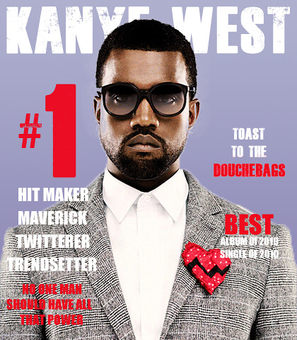
Vibe is a hip hop,
R&B and rap style music magazine, which would have magazine adverts based
on this genre style of music. This magazine advert is ironic for the style of
music magazine, the advert itself holds to 4 of the conventions of a magazine
advert. It’s an advert of Kanye West’s first album Kanye West, and it shows him
centred and the relevant information around the outside.
Finally the music
magazine BBC Music Magazine is based on the classical, and more sophisticated
adult sounds. It would have many adverts in similar to the style of
this one, as its aimed at the older generations of music lovers the
advertisements differ slightly they focuses less on the brashness and vibrancy
of the advert rather on the feel and of the establishment of the
artist/band. With it being focused around classical to sophisticated
styles of music there is less new talent rather more established ones releasing
another album so the fan base ii s there and there is no need for boldness in
the advert. This advert has focused on the content of the album
rather than reviews.
All of these conventions, techniques and variety of methods used in magazine advertisement, coupled with my results from my survey allow me to decide on the basis of how I want my artist and the album to be portrayed. In the best manner and with the greatest success of persuading the audience to buy the album.
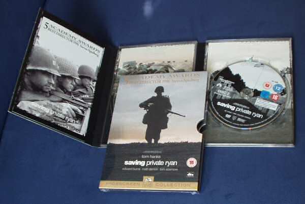
Digipak's are a varied version of CDs; it can also be for DVDs and Blu
Ray Discs. They have a generic, unique style, as they all open and fold out
like a book; this is one characteristic of digipaks alongside:
·They are
made from paper/card materials
·They
usually have 4 or more panels
·They also
usually have a CD and DVD combination
·They have a
booklet to explain either the artist or the album
Digipak's do however cost more than traditional CD's and are therefore
only used when the record company think that either the album will sell well
enough to make profit or when the style of the artist or the album is
unorthodox and therefore fit the unorthodox style of a digipak. Here are some
examples of digipaks:
·Saving
Private Ryan, DVD digipak, directed by Steven Spielberg and earned over $44
million from sales.
·U2 (Achtung
baby) is a CD digipak, is U2's 7th studio album, released in November 1991 sold
well over 14 million copies. It was part of the outstanding discography from U2
a well-established band with many number one album’s and singles worldwide.
·The re-released version of 'Brave heart' in blu ray
digipak form. It was directed by Mel Gibson and made over $210,409,945 in the
box office, the re-released version was to enhance the visual image as well as
the sound, and it also acted as a way of releasing the film again adding to
sales and profit.
All of
these various types of digipak have been incredibly successful in the
individual field. They have also paved the way for more bands, artists and
films to look into the digipak form to portray their product to their audience.
The video shows to good effect crosscutting of the
swooping of shots from different lines of action. The sports stars getting
ready to play sport (American Football and baseball) and the band preparing to
go on stage and this is developed throughout the video, cutting between band
and sport out takes or funny moments.
The video echoes the narrative in the song. The
song being all about the ups and downs that we face in everyday life! The ups
are represented by the sports stars performing – however there are clips of
them performing with less aplomb than usual – tripping over, fumbling passes
etc. I feel that I don’t want to have such a close link in my video as how we
want the world to be is very individualistic and if I portrayed it one way;
others may dislike it and not watch the video.
With the number of shots of the band star image is
promoted. I feel this is not an important factor for me in my video and I
personally feel that there is close to the maximum film of the band performing
in this video.
A variety of shots are seen throughout the video.
·The video uses to good
affect Graphic Match in the opening clips. The lines of guitars linked with the
line of baseball bats. The musician putting on the wrist bands – the sports man
his gloves and placing his box in his trousers with the artist buckling his
belt. These shots closely tie together the two elements of this video.
·Tracking shots follow
the band as it moves from the dressing room to the stage.
·An overhead shot of
the drummer, the coach walking along the side line and numerous sporting clips
from an overhead angle
·Low angle shots are
used to show despair of the coach with his head in his hands.
·Tilt shots of the
guitarist, when having focused on his feet the camera tilts up and out to show
a complete shot of the artist.
·Most of the pictures
of the artists are heads and shoulders or close up. There are some shots where
the band is playing on stage which can be termed mid-shot.
·The transition or editing is all straight cuts with relatively short
quick clips to introduce the subject matter. This is an idea I would like to
use in setting the scene quickly and to hold the audience guessing about what
is going to happen next.
Aerosmith - 'Don’t
want to Miss a Thing'
Close links with the film Armageddon
Opening image – a Long take of the planet moving
through space. It doesn't have much action but as it moves towards the viewer
there is a feeling that it will come through the screen and the tension begins
to build from the off.
The transition is by way of a quick dissolve from
the planet crashing to Aerosmith appearing. Following this there are straight
cut editing techniques between the performer and clips from the film
Armageddon. The shots from the film briefly introduce and develop the story
line As a result the climax of the film script is reached quickly without the
viewer having to watch the film they can understand the action.
The video cleverly uses clips of the band
superimposed over the original film. This gives the impression, through skilful
editing that the band is in the film, viewed from NASA control room actually
out there in Outer Space. This artistically links the film with the band and
the song and unlike other videos from films which simply cut from the musicians
to action from the screen. Later on in the video the back drop to the orchestra
and the band appears to be inside a cavernous metal structure and leads the
viewer to feel that this could be another area of the space craft seen in the
film. Again this enhances the link between the band and the film.
The narrative of the song begins to link with the
action on the screen as the musical score builds towards the chorus images of
the leading couple appear saying their goodbyes and moving away.
The use of a variety of shots cleverly and
skilfully enhances the singing and music. Overhead shots are used to diffuse
the power of Aerosmith’s voice. Tilt shots (from above to waist height) bring
the viewer back down as his voice softens. In contrast as the volume once more
rises the camera tilts upwards across the flags.
Straight cutting of short clips builds the tension
as the space ship takes off and the music once more builds towards a crescendo.
At this moment the viewer is once again transported back into the film when
watching the space craft launch smoke appears under the craft as it lifts. The
following shot is of the band being engulfed by similar smoke. The thrust of
the engines creating wind through the sectors hair, moving their clothing etc.
is again echoed cleverly through this cross cutting technique to link the band
to the film set.
The end of the video finishes with a reverse tracking shot leaving the
actress alone in front of the screen.
Eagle Eye Cherry – 'Save Tonight'
There are many things from this video that I like and would like to
incorporate into my own production. The video follows the singer who takes on a
number of different characters. This is a base for where I wish to start my
video, I will incorporate more and add my own twist onto it, but the way the
tracking shot done through the use of steady cam has been done flows from one
scene to the next. The reason that I’m inclined to continue with this idea is
because of the way that it incorporates a performance element, as well as a
storyline, running simultaneously together, this not only looks better than
confusing edits back and forth from storyline to performance. It also on the
other end of the spectrum doesn’t swing entirely performance related or
entirely storyline. Another selling aspect of this video to me is the way in
which edits are put together, for example he walks out the shot, seemingly
heading for the door then an edit to outside where he has taken the place of
another person. This keeps the singer alive and doesn’t mean that he has to
keep the same character flowing, as well as allowing us to see different angles
of the production. I really like this idea and would like to mould it into my
own production however instead of the singer changing characters he would only
change costume from set to set. This is so the star image of the artist is kept
alive.
Lupe Fiasco – 'The Show Goes On'
This video has many aspects to it which I think both
work really well and that I admire. Firstly the camera tracks the performer as
he makes his way to stage. Other from this I also like the use of close ups to
start the music video especially of the performer and how he is preparing for
his performance on stage. I feel that this adds detail to the video and it is
an idea that I’d like to develop into my own music video with a different
element not focussing on the same things on different aspects that are relevant
to my artists track. Another key factor of this music video which I feel could
help me with ideas for my own music video is the performance element and how
this is done on the way to the stage to the camera head on so there is an
amalgamation of storyline and performance both running perpendicular to one
another. The incorporation of live shots seemingly from a concert or gig, give
the production a more real feel about it and this is something that I feel
works well and also enhances the music video to a higher level. There can be
some types of theory that apply and fit in with this music video for example
Goodwin’s theory of music videos says there will be certain aspects that will
be included. This video adheres to some of those statements for example ‘That
there is a relationship between lyrics and visuals’. This can be recognised
through the way in which he is working to the stage to perform a show and the
lyrics to the song mean that the ‘Show must go on’. This is directly linking
the audio and visuals together. This is a theory that I’ll be looking at and
try to incorporate some of the aspects that Goodwin feel are paramount for a
music video. Alongside this theory there is also loose connotations of
voyeurism through the use of flashing cameras say that he is constantly seen
and being viewed, this links to a star image with the camera flashing. This
could have been intentional to build a star image and an idea of pleasure from
watching the video or the artist.
Music video
directors are used to supervise and direct the music for a video. However the
combination of music and visual media is responsible to the musical supervisor.
They handle, negotiate and incorporate audio with visual images, to create
music videos.
Mark Romanek born September 18, 1959. Mark is an American music
filmmaker who has had many notable achievements in the music industry in
directing of music videos. He has 19 MTV awards, and 3 Grammies more than any
other director. He is a cross-genre director not aiming or specialising in a
certain area making him versatile and his abilities stretch further than
others. His first music video 'Closer' by Nine Inch Nails, caused controversy among
critics saying it was dark and disturbing however this was a reason it was so
popular with the fans. The artists he has worked with are a wide range from
Michael Jackson, Johnny Cash and Jay-Z, all of which have either proved him
with award success or with praise from the fans or the artist. He has also been
involved in feature films, directing 'One Hour Photo' starring Robin Williams,
he has also been involved in various other films and is signed on to make a up
and coming horror, thriller featuring Ben Stiller.
Notable pieces of work that Romanek has done within the music industry
is to direct the claimed, most 'expensive' music video ever, 'Scream' by Janet
and Michael Jackson, costing over 7million to make.
Other
achievements include the making of Johnny Cash's music video 'Hurt' winning an
award for best cinematography in the process.
Alongside these great successes he has also made the videos:
Coldplay - 'Speed of sound
Jay-z - '99 problems'
Madonna - 'Bedtime story'
Iggy Pop - 'Beside you'
David Bowie - 'Jump they say'
Spike Jonze was born in October 22, 1969. He is an american
director and producer, and has been nominated for various awards. He was also a
co-founder of director’s label, alongside Chris Cunningham and Michel Gondry.
Currently Jonze is a creative director of VBS.tv. His music video portfolio
consists of working with Jay-Z & Kanye West, Fatboy Slim, Kanye West,
Weezer and the Beastie Boys. Spike Jonze has also been involved with majorly
successful TV shows and films, including producing and co-creating Jackass the
series and films. His music videos have been summed up by http://www.imdb.com/
as being 'off-beat in their visual storytelling, particularly their mix of
live-action, animation, and puppetry.'
Some music
videos Jonze has been involved with have been:
Kanye West - 'Flashing Lights'
Fatboy Slim - 'Praise You'
Beastie Boys - 'Sabotage' and 'Sure Shot'
Weezer - 'Island in the Sun'
Ludacris - 'Get Back'
His most
recent music video is Jay-Z and Kanye West's, 'Otis'. The video is up for
nomination in the 54th Grammy awards in 2012, for Best Rap Song and Best Rap
Performance.
Although
this is not a music video instead it’s an advert for a newspaper, it
illustrates the ideal concept in which I’d like to base my music video from. It
follows the singer as he performs his song whilst on the move through various
different sets and scenes where there are matches to the sets and props that
are used and the lyrics in the song. This is a single long take of the
performance and no edits which is where my production will be different as well
as having different sets and props.
The way in
which this is shot from a tracking side on shot whilst the singer is walking
along the pavement creates the long take. As this is a multi-million pound
newspaper and there was probably a high budget for this advert it means that
the singer can have the entire sets and scenes all in one line and for him to
only pass down the line once timing every scene to the song. As I’m on a lot
lower budget I can’t afford to place all of the scenes in a horizontal line and
have one take. This is why I have chosen to use the doors that the singer will
go through as edits to another scene which wouldn’t be on the other side of the
door that he opened instead it would only appear as an illusion that it was.
This way I can cut down filming into days and work on one set for each day. There
are a lot of videos that decide to use the long single take for a music video,
and if done perfectly it can look extremely professional however as I will not
be having the original artist I will therefore need to fine an actor that would
be able to learn the entire song and fit it into the duration and the timings
of the song in order to do one long take. I also feel that the edits will look
good and allow more detailed lyric matches to take place such as the clothing
of the singer where it will link with the song.
The lighting
in this video is all natural as it is all filmed from outside. I will need to
use artificial light which will add a difference, this is due to the availability
and timing to set up, film and take down the sets outside with limited help. It
would be also harder to make the set outside especially for those that need
more detail for example a club or a bar which will be one of the scenes.
The
character base for this production is lots as they are able to pay performers
and extras to be in the video as mine is a lower scale production I will be
trying to create the same affect and the similar quantity with a much lower
character base. This then links to the different scenes at different venues and
being able to reuse the same characters in different roles. This is an example
of utilising the resources I have to the maximal potential.
The props
that are used in this production are frequent; this is the same frequency that
I wish of my production linking in as many props to lyrics as possible. As well
as having large props and even characters and sets that is mentioned in the
song I’ll be using.
Video shows the relationship of Rihanna and her partner. The video
clearly shows the emotional turmoil’s as well as the ups and downs of
relationships and love. The start of the song is a prologue from a young girl
explaining an experience about love and partnership. It explains how love is
hard and it speaks as if a break up or loss of love has occurred, setting a
negative tone to the song from the outset. The song however kicks in later in a
very vibrant and upbeat manner. As the song seems to follow the path of the
couple and the song reflects the on screen images it continues with the
prologue and shows the relationship as being beautiful and exciting at the
beginning but turning into pain and heartbreak if it were to end. Editing:
The
overall editing in the video is done through straight cuts, however there is
varying speeds at which the cuts appear, they start off slow and build up
during the fast paced parts of the song where the beat is building to drop is
an example of where fast cuts have been used until it drops into the heavy bass
beat after. There is also the manipulation of certain shots, in which the shot
has been slowed and sped up in speed the extension of time is an expansion of
time. There could have been many reasons to this from the effect allowing a
break from the normalities of the video conventions? This breaking of a mould
could possibly have meaning that the video is a postmodern production. Also could be an effect allowing us to see
that scene for a longer duration possibly for importance. I feel that more a
connection lies with the couple being in there own world. The entirety of the
video they are shot together with rarely seen contact with other people. The
performance of the song when Rihanna sings in the bedroom, and the use of
superimpose is vaguely present, this is done with the projection of the sky
over Rihanna whilst she performs.
Camerawork:
The
video combines performance and narrative together it overlaps the use of the
same sets. There is a greater percentage of narrative to the performance
element. This is where my production can’t follow suit, due to my video being a
debut video for an up and coming star which needs to create the star image
around the artist. There is an abundance of two shots used throughout the video
as the songs mantra is of love and a couple. All of these two shots shows the
partnership and relationship that’s growing between the pair throughout the
video It reveals to the audience that they are in love and as the title recites
they found there love a ‘hopeless place’. There is often interjects of single
shots mainly during the performance elements as this aspect is where the Star Image of Rihanna takes place. The
mostly used shots include close ups and mid shots, these are used to highlight
the theory of star image. Establishing shots are also used frequentlyas
to set the scene for the various different sequences.The
overall feel that comes from the music videos camerawork is one of fluctuating
moods from fast paced up beat action to the start long takes to create tension.
There is lots of movement within the shots to add confusion to the viewer this
highlights area of confusion around the relationship. Alongside the use of two
shots there is also a mix of shot reverse shots and reaction shots mixed
together in this as the song is very thought provoking and the characters are
always together the shot reverse shot builds up the image of their relationship
and relays it across to the audience
Theories: The majority of the shots are close ups on the face, with inserts of
imagery, this links to the theory posed by Richard Dyer about stardom. This use
of close ups on the artist face makes them memorable and links to the other
media they have including, posters, merchandise and CD covers.
The link to Steve Archer’s theory of repeatability this is linked in
with the Voyeuristic nature for males and for females there are very fruitful scenes
that are the leading up to sexual intercourse. This risqué approach leaves the
audience wanting to watch multiple times and they’re left intrigued and
satisfied.
Jacques Derrida’s deconstruction theory can be seen in the production
there are two main binary opposites that are present in the video. Firstly the
binary opposite of love and loneliness, as they don’t want to be with out love
as they are together but at times it looks like they are close to the end of a
relationship and the fight between which opposite drives there fear more until
the final scene when a choice is made. The second binary opposites is male and
female in this sense it’s the domineering position in the relationship and both
want to be in this position and they are to alike to connect properly. These
binary opposites
There
are some postmodern conventions in the production for example I feel there is a
non linear narrative in the sense that the prologue to the video talks about a
break up and a negative experience with love. This is something which is
present throughout the song and eventually with the walking out of the
relationship. This makes the starting of the video the ending. Another
postmodern code that I feel can be identified is the possible dystopian
narrative, by which she finds love and yet ends up walking out therefore ending
up alone. This links to the binary opposites of the love and loneliness
argument. Is ‘We Found Love’ a postmodern text? Yes I feel that the video by
Rihanna is a post modern text, whether intended or not there is strong bulk of
theories and conventions from the postmodern era that are present in the video.
This abundance makes is hard not to label the video post modern.
Voyeurism:
Voyeuristic
nature is used within the narrative; it’s used as the couple are intimate with
each other. This voyeuristic images helps the viewer mainly concrete in there
head that the couple are in love and romantically intimate. The scenes when
it’s used are sped up as to give the feeling to the audience that although they
are evidently in love that maybe this has been rushed into and not meant to
happen yet. Another scene when typical voyeurism is used is when Rihanna is
running into a field and she takes her top off, without having underwear on,
this provokes the male instinct and makes in memorable to the male audience
immediately. This also helps to link in with Steve Archer’s theory of
repeatability. Mise en scene: The mise en scene used in the
video, is mainly through adult related themes, and the narrative. The first
major use of mise en scene in the video is through the use of pills in
excessive amount. These pills bring the view of drug use and possible overdose.
They also create a link with the song about addiction and being addicted to
things, other things that can be addicted to are also used In the video. These
include: ·Alcohol ·Drugs ·Smoking ·Gambling ·Sex These are five main things that are both adult related and
things that can become addicted this theme is carried through to link with the
song about love and being addicted. These pills placed in then ties
together the slowing down of time in the shots preceding the pills,
strengthening the bond that they are either on drugs or affected by
drugs. Develop, use or
challenge forms and conventions? The music video very much does follow all of the forms and conventions
of music videos; it has a fast paced video that matches the pace of the song. There
are lots of straight cuts between different shots and sets. There is little to challenge
the conventions of the conventions it’s brightly shot with lots of shots of the
artist to increase the star image. It also tells a story with the lyrics and
the on screen image.