Saturday 8 December 2012
Thursday 6 December 2012
How effective is the combination of your main product and ancillary texts?
Firstly the artist’s logo is used throughout the media products from the video to the texts. This creates a buzz around the logo and a direct link is made between the artist and the logo. This starts a brand for the artist that is recognisable throughout different media’s. The logo can be used either in a fashion brand and this base can lead to synergy of a brand across different companies and different aspects for example posters, clothes and merchandise can be made from this distinct personal logo.
I have also linked the magazine advert and the digipak and the video through using the same pictures throughout all the products. This triggers a memory spark in the populations mind and the can associate the video with the advert and the digipak and vice a versa. It will also seem familiar if the digipak is on the shelf and this will be more appealing to the buyer as they will feel a connection and a sense of deja vu.
All of the products create a relationship with one another intertwining and it forms fluency throughout the artists debut single and video. The rest of the planned shots for the digipak where all taken from the video that show a link to the artist, the brand or show the artist himself.
The skateboard also links the magazine, the digipak and the video althogether makes a bad boy, rebellious image as well as being a link across all the texts.

It makes the profile of the artist very simple and easy to understand and most importantly memorable to the audience. It also allows for a base of growth among other forms of media. And draws links with the audience and the texts themselves.
Sunday 2 December 2012
Friday 30 November 2012
Thursday 22 November 2012
Wednesday 21 November 2012

Tuesday 20 November 2012
Analysis of a Digipak (McFly - Radioactive)

Radioactive is McFly's
4th studio album, released in July 2008 and it has sold well over 90,000 copies
in the UK. The Radioactive digipak, has six panels in the orthodox style of
pull out, and has a CD, DVD combination, also with a 32 page booklet from the
band, and a single panel pull out of dates of their upcoming tour. The digipak
has also gone worldwide, reaching the platinum certification in Brazil were it
sold over 100,000 copies. The album includes singles such as 'One for the
Radio' and 'Lies' which both reached the top 5 in the UK Singles Chart.
This is the front
cover/panel:

This front panel
portrays the band, to the audience clearly because they haven't been as well
established as much as of artist. It also incorporates loud, vibrant colour to
grab any audience attention when on the shelf, it also includes drawings or
rough sketching’s used, which links with the Radioactive theme. As the
sketching is of a microphone that has mouth, showing when exposed to
radioactive material evolution can occur, linking the title to the narrative,
whilst also involving a drawing for the younger audience that this band and
album are aimed towards.
Below is the middle
three panels:

These middle three panels
follow the same style as firstly a traditional digipak with a pouch for a pull-out
usually booklet, the CD in the middle and a DVD on the making of or a tour.
Secondly it continues with the radioactive theme with the radioactive green colour,
and also the mutant microphone. The CD and DVD have both been adapted slightly
in order for the audience which for this band is female kids through to teens,
makes it easier to separate between them, it also adds another colour dimension
one which carries on the theme throughout.
Here is the pull out
booklet and single panel tour date pull out:
 |
| Front panel of the tour dates pull out |
 |
| Front cover of the pull out booklet |
 |
| Back panel of the pull out tour dates |
The tour dates pull-out
has all the information on where they will be playing and where to get tickets
from: aimed at publicizing the band and tour even more to an audience which
already has the album and therefore more prone to going to the tour.
The overall aesthetic feel
of the digipak, is grabbing and definitely stands out at the audience, with the
bright colours, cool sketching drawings and unorthodox digipak style which
shows that they could be adding a new dimension to there music and overall feel.
Monday 19 November 2012
Analysis of a Digipak (Bruce Springsteen - The Promise)
Digipak are book style
versions of CD's the hold the same contents however they are mostly made up of
paper rather than the traditional CD case which is made of plastic.
They usually hold the same things for example the CD and a booklet
made by the artist either telling the audience about themselves, the album or
the songs. They always fold outwards to reveal at least six panels sometimes
this does change with artists. They do however cost more to make and therefore
there are less of them and they are of a higher price than ordinary CD's.
This
is Bruce Springsteen's digipak called 'The Promise'. This is his 17th
studio album released in 2010 and it reached 7th in the UK album
chart. The digipak has 6 panels with an extended booklet with lyrics to
the songs inside. It also is a double CD digipak splitting it onto
two separate discs. Finally it also has information on the album from its
birth to its production written by the artist or the producer.
This is the Front
Panel:

This front panel is
very minimal with some small information in the corner, the title and a picture
of the artist in a scene. I think that this style is chosen because it has been
his 17th studio album and therefore he has already established himself as an
artist, However to a new audience this cover is catchy and moody, with the
seemingly dark to light style picture in black and white and the old
traditional style costume and American muscle car, possibly portraying his
style of music.
This is one of
the inside panels:

The panel on the left
is the back off the booklet that's been glued into the digipak with a black and
white picture of the artist inside, presumably in a derelict building. The
other panel is on the front of the pouch which holds the first CD. This picture
is in opposition of the next two panels as both these panels are seemingly dark
pictures, juxtaposing the next panels that are light and bright.
The other two inside
panels:

These panels are similar to the previous two apart from them being
lighter, the panel on the left is the back of the first CD pouch and the panel
on the right is of the front of the second CD pouch; this panel is also glued
to the back of the digipak. These pictures follow the same genre and style as
the rest of the digipak, very minimal and aiming at the audience's visual
interpretations as there is no written information to pick up.
This is the back of the Digipak:

This final panel is of the back of the digipak, which in total has
the most information on it about the contents on both discs. It also has in the
bottom left hand corner the artist record label and the producers of the album,
along with the bar code The style of writing that all the information is
written in is unique it's an old typewriter style that fits in the pictures and
the whole style of the digipak.
Saturday 17 November 2012

Friday 16 November 2012
Magazine Advert Planning

Here is the
rough plan for my magazine advert showing how I will position and construct the
actual thing.
Analysis of Magazine Advert (The Strokes)
Angles is The Strokes 4th studio album released on the 18th of
March, and it reached 3rd in UK album charts, also continued to appear in the
charts for the next 10 weeks. The album included hit singles that reached the
top 50 of the UK singles charts. The band has been established 1999 and has
been successful as to create and a name and a brand for the band. This advert
was taken is a still by myself from the, July 2011 edition of
the musical magazine Q.

Font: The font used on this
magazine advertisement is bold and vivid to the audience; it’s in the typical
matt black colour, with varying font sizes dependent on the relevance of the
information relayed. The heading at the top of the page is the largest on the
page and shows the band’s name to portray to the audience that this is the name
of the band. It also makes it easier for the audience to recognize who
produced the album advertising other music made by the band. Immediately
below the band’s name is the album title in a lesser bold colour but still very
visible to the audience, making it eye catchy and simplifying the amount and
relevance of the information. Finally following all the vital information which
is clearly visible and catches the audience comes the reviews, that has also
been simplified so that instead of long winded quotes about the band and the
album it just relies on the rating system by using all the stars, to show that
this album is loved which the audience would look for. This would be something
I would look to incorporate into my own magazine advert as not only does it
show positive feedback and reviews but also, makes it simple for the audience
to understand and read.
Colour: The colours that were
chosen for this advertisement have been chosen for significant reasons in that
the yellow, highlights and complements the black font not only making the font
and out furthermore but also to grab audience visual attention when
flicking/reading through the magazine. Other colours used are varying
shades of pink and blue, the shades go from a lighter version to the darker shades;
it’s used in conjunction with the artistic symbol in the centre. Finally there
is a checkerboard effect filling the bottom half of the background as well as
the yellow which is on the top half. This checkerboard effect I think was used
because of the optical illusion value that it has, and that it links in with
the artistic symbol in the centre. It also adds to the dimensions of the
magazine advert, in that more colours are utilized and a pattern is integrated
into it which breaks up the solids colour and also links with the shading
technique used on the artistic symbol.
Page
Design (Layout): The design of the page
is much centred and deliberately positioned, it keeps the entire contents
mainly centred and therefore symmetrical either side. The writing is all
focussed at the top of the advert as to ensure that the audience can read it
and it's all in one place and uniformed and simplified. The artistic symbol in
the centre is directly centred, to amplify its importance and influence, the
shape its self is an optical illusion, based on the artwork from M.C Escher,
the design is perceived to always be going up one and yet it links back around
and joins at the bottom. It links itself to the album title of angles as it’s a
mind trick, playing on angles and the way we read it. The background also adds
as an optical illusion, as it look like the bottom of a wall joining with the
floor and yet it’s all printed on a flat 2D surface. There is also a half
border around the bottom of the advert and the right hand side of the advert to
add more angles linking with the album and also adding to the illusion of the
advert. All of these ideas intrigue the audience and pull them in to reading
the advert and opening them to either the band or the new album.
Research into Magazine Adverts
Magazine adverts are
used by artists and band as a way of publicizing themselves to an interested
audience. The magazine adverts that bands and artists use are mainly in music
magazines, as this audience is already interested in music and in some cases that
type of music dependant on whether it’s a genre related magazine. Some examples
of music magazines include: NME, Q, Rolling Stone, Mojo and Top Of The Pops,
genre related music magazines include: Kerrang which is rock genre related,
Vibe which is Urban and Hip Hop style music, Music which is a classical based
genre magazine and Billboard which is a pop music based magazine. All of these
magazines attract different artists and bands to advertise their music, albums
or singles. Music magazine adverts generally follow a certain format as to
ensure the right, relevant information is relayed to the audience, these
conventions include:
- The
artist or the band’s name e.g.
Gnarls Barkley
- The
album title being advertised e.g.
St. Elsewhere
- The
date of release e.g.
April 24th 2006
- Any
reviews or feedback from listeners e.g.
a rating system of stars
- Where
it can be brought from e.g.
downloaded from iTunes
- Sometimes
featured songs from the album e.g.
Crazy
- Finally
either a picture of album, band or the album cover used as the advert
 | |
These techniques are
used so that the audience receives the information needed, in the simplest form
making it easier for the audience to decide on whether to buy it.
Why are magazine adverts used?
Adverts in general are
used as a way of persuading the audience to take action on a certain product
for example persuading a reader to buy your album. There are a extensive
variety of advertising methods used but one that directly gets the music loving
audience is magazine adverts in music related magazines. This type of direct
advertising cuts out the people are either on the edge or not interested at all
and solidly informs music lovers about the album.
Where are they used?
Magazine adverts are usually
used in genre related music magazine in particular as it goes from the general
direction of music lovers, in music magazine down to followers of a certain
genre. An example of a genre related music magazine includes:
|

These magazines would
all have genre related music adverts in them as to persuade genre loving, music
enthusiasts directly. Kerrang music magazine is a rock based genre and has
magazine adverts like British Intelligences new album (Street Fight), which is
a rock based band up and coming. The advert itself has all of the conventions
of a magazine advert, this is down to the band being new and therefore little
known about them and they would need to persuade the audience more than an
established band.

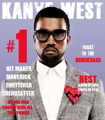
Vibe is a hip hop,
R&B and rap style music magazine, which would have magazine adverts based
on this genre style of music. This magazine advert is ironic for the style of
music magazine, the advert itself holds to 4 of the conventions of a magazine
advert. It’s an advert of Kanye West’s first album Kanye West, and it shows him
centred and the relevant information around the outside.
Finally the music
magazine BBC Music Magazine is based on the classical, and more sophisticated
adult sounds. It would have many adverts in similar to the style of
this one, as its aimed at the older generations of music lovers the
advertisements differ slightly they focuses less on the brashness and vibrancy
of the advert rather on the feel and of the establishment of the
artist/band. With it being focused around classical to sophisticated
styles of music there is less new talent rather more established ones releasing
another album so the fan base ii s there and there is no need for boldness in
the advert. This advert has focused on the content of the album
rather than reviews.

Thursday 15 November 2012
Research into Digipak's
Digipak's are a varied version of CDs; it can also be for DVDs and Blu
Ray Discs. They have a generic, unique style, as they all open and fold out
like a book; this is one characteristic of digipaks alongside:
· U2 (Achtung baby) is a CD digipak, is U2's 7th studio album, released in November 1991 sold well over 14 million copies. It was part of the outstanding discography from U2 a well-established band with many number one album’s and singles worldwide.


· They are
made from paper/card materials
· They
usually have 4 or more panels
· They also
usually have a CD and DVD combination
· They have a
booklet to explain either the artist or the album
Digipak's do however cost more than traditional CD's and are therefore
only used when the record company think that either the album will sell well
enough to make profit or when the style of the artist or the album is
unorthodox and therefore fit the unorthodox style of a digipak. Here are some
examples of digipaks:
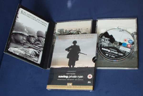
· Saving
Private Ryan, DVD digipak, directed by Steven Spielberg and earned over $44
million from sales.
· U2 (Achtung baby) is a CD digipak, is U2's 7th studio album, released in November 1991 sold well over 14 million copies. It was part of the outstanding discography from U2 a well-established band with many number one album’s and singles worldwide.
·
The re-released version of 'Brave heart' in blu ray
digipak form. It was directed by Mel Gibson and made over $210,409,945 in the
box office, the re-released version was to enhance the visual image as well as
the sound, and it also acted as a way of releasing the film again adding to
sales and profit.
All of
these various types of digipak have been incredibly successful in the
individual field. They have also paved the way for more bands, artists and
films to look into the digipak form to portray their product to their audience.
Wednesday 24 October 2012
Filming Schedule
Date: Saturday 26th
October
Place: Bramcote
Village.
Time: 12 till 1:30.
Actors: Myself.
Equipment: Camera and
Tripod.
What are we
filming?
The first verse of the song plus additional shots to be put in amongst the rest
of the song.
Transport: Car.
Risk
Assessment completed: Yes
Weather
Forecast: Sunshine.
Duration: 1 and a half
hour long.
Date: Saturday 26th
October
Place: St Georges
Park
Time: 1:40 till 3.
Actors: Myself
Equipment: Camera and
Tripod.
What are we
filming? The
second verse of the song and additional shots to be edited throughout the rest
of the video.
Transport: Car
Props: None
Risk
Assessment completed: Yes
Weather
Forecast:
Sunshine
Duration: 1 hour and
20 minutes.
Date: Sunday 3rd
of November
Place: Wollaton
Park
Time: 12 till 1:30
Equipment: Camera and
Tripod
Actors: Myself.
What are we
filming? The third verse of the song with again
additional shots that can be edited throughout the rest of the video.
Transport: Car
Props: None
Risk
Assessment completed: Yes
Weather
Forecast: Sunshine
Duration: 1 hour and
30 minutes.
Tuesday 23 October 2012
Risk Assessment
|
Risk
|
Danger /
Injury / Outcome
|
Level
|
Risk
reduction/prevention
|
|
Losing
/damage to camera
|
Total loss
of equipment
Damage
|
2
|
· Camera kept in bag when not in use.
· Camera kept in rucksack for
transport – strapped to back
· Use of other preventative action
outlined below – observer to watch for hazards
|
|
Loss/damage
to tripod
|
Total loss
of equipment
Damage
|
2
|
· Tripod carried carefully and kept
with cameraman during filming.
|
|
Risk of
injury when walking through wood
|
Eye
injuries,
Tripping on
branches on the ground. Uneven ground causing trip or sprain to ankle.
|
3
|
· Practice walk-establish safe route
avoiding branches & moving trip hazards.
· Guide for cameraman – steering and
watching for risks.
|
|
Filming in a
Car Park
|
Vehicles
moving around.
|
3
|
· Guide/observer for actor and
cameraman.
· Have a safety position where all
personal stand when not filming.
|
|
Skateboarding with camera.
|
Dropping
the camera or falling off the skateboard.
|
1
|
· A
spotter will ensure that I am in no danger from hitting anything.
The hand strap will be used at all
times secured tightly.
|
|
Location 1 – Bramcote.
|
No real
risks with the location that hasn’t been highlighted as a risk already.
|
3
3
|
Be careful and sensible when filming on the
location as this is a residential area.
|
|
Location 2 – St George’s Park.
|
No
excessive risks.
|
2
|
Be considerate that’s it’s an open, public
park and there will be other people using the park. Ensure no misconduct or ill
behaviour from all the team.
|
|
Location 3 – Wollaton Park.
|
No higher
level risks that haven’t been addressed.
|
3
|
Have a
contact as the filming will be done away from the path and the public park
users.
|
Level of risk
explained:
1. Likely to occur – high risk
2. Possibility of occurring – medium risk
3. Little possibility of occurring – low risk
4. Extremely unlikely – No risk
Subscribe to:
Posts (Atom)